MySubscriptions Widget Placement
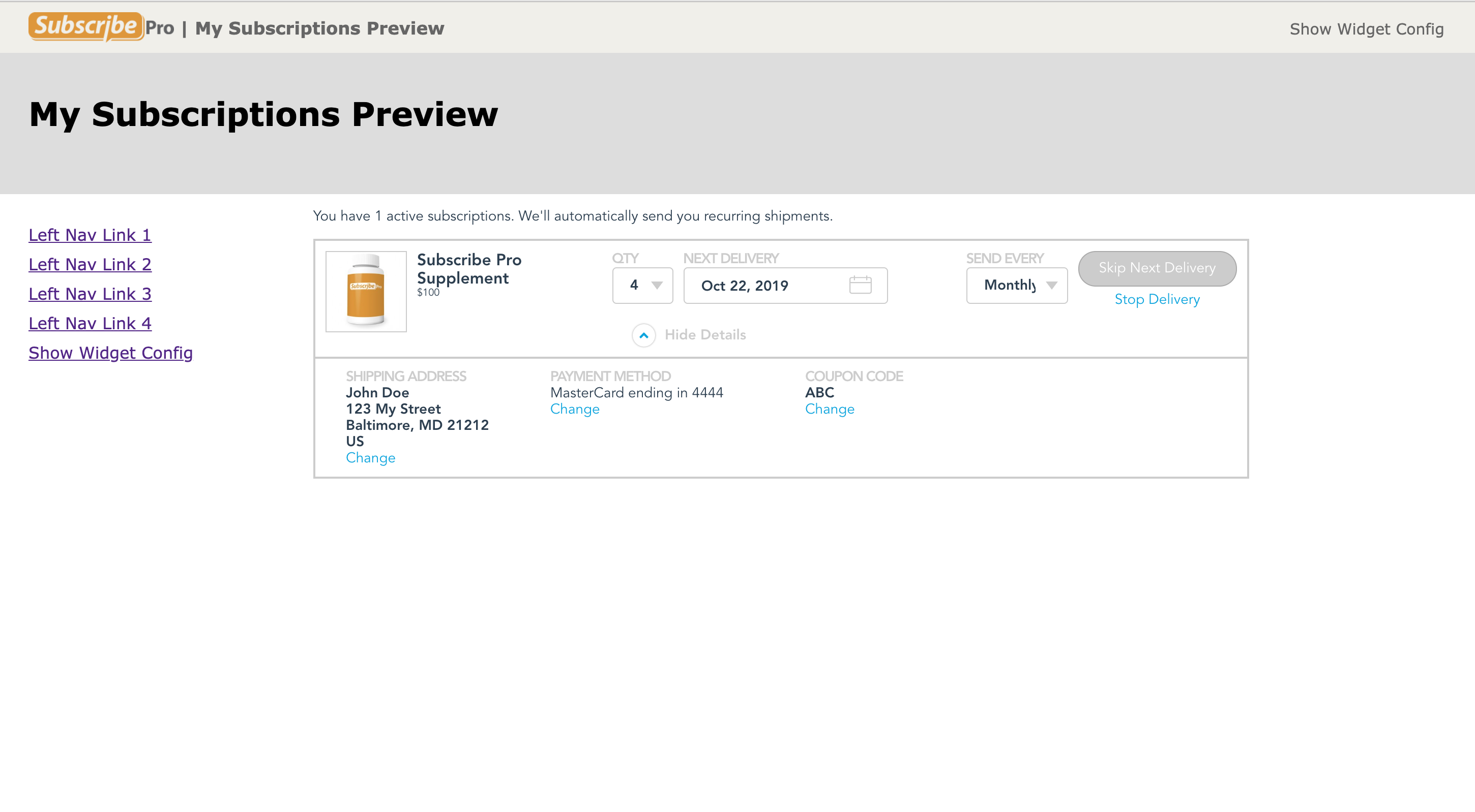
The MySubscriptions Widget is designed to respond to the device where its used as well as to support a variety of column widths for the containing website and <div> element.
Desktop
On desktop-sized devices, the My Subscription Widget is designed to be used with a page header and footer provided by the hosting website. The widget is designed to be used either with or without a left navigation menu.

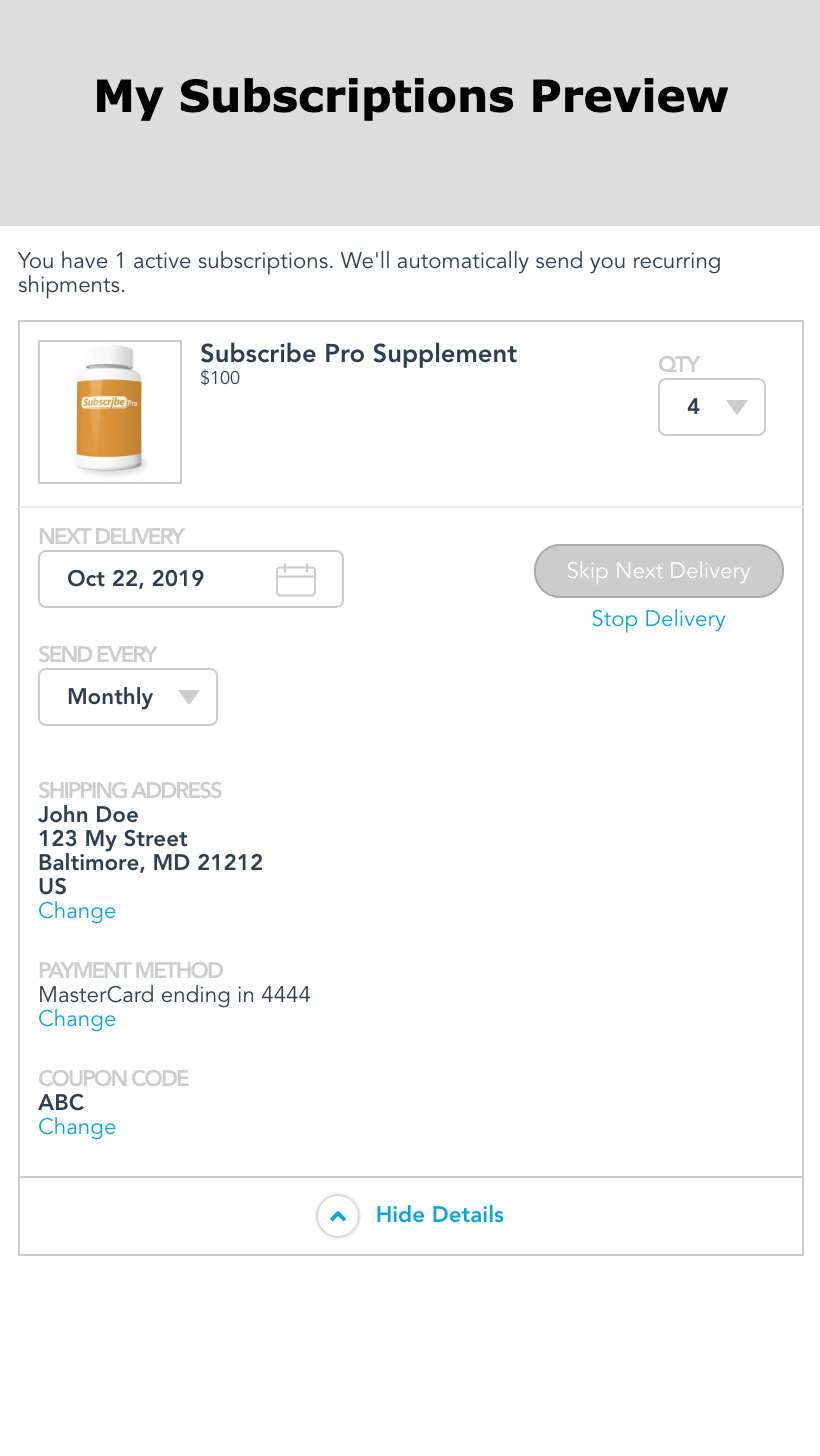
Phone UI/UX
The MySubscriptions Widget includes an alternate layout which is used on phones. On phone-sized devices the widget <div> should fill the entire screen except for a small header.
